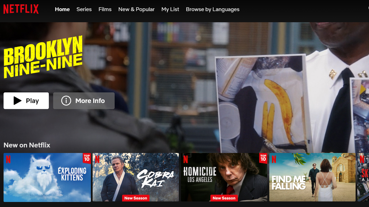
Netflix has revealed that it’s in the process of completely overhauling its homepage – a user interface (UI) redesign it claims will be “our biggest update in a decade”.
As part of a letter to its shareholders covering its Q2 2024 earnings, the streaming titan revealed it was developing a “more intuitive TV homepage” that would make it easier for you and I to find our next favorite movie, TV show, and/or videogame.
Netflix didn’t provide any images that tease what the revised homepage will eventually look like, so it’s unclear how different it’ll be to the one that fans have become accustomed to. The world’s best streaming service, though, suggested its homepage refresh will not only make it far easier to find the type of content we enjoy, but also provide more key information to consumers to help them determine whether they should stream it.

“While our recommendations are widely recognized as industry leading,” Netflix said. “We believe we can do much more to improve discovery on Netflix. So, we recently began testing a new, more intuitive TV homepage design, our biggest update in a decade.
“This new interface provides more visible title information at a glance – including synopsis, genre, and ratings. Title previews are also larger and more dynamic, with more immersive trailers and bigger box art to make browsing easier. We’ve also simplified the navigation bar and moved it to the top of the page to create quicker, easier short cuts. And this new design includes ‘My Netflix’, which has everything members have saved or watched and was previously only available on mobile. As always, with any changes to our product, we’ll listen to the feedback, learn and continue to improve the experience over time.”
An insurmountable userbase lead?

Netflix’s homepage redesign announcement comes as the streaming giant celebrates plenty of big wins heading into the second half of 2024.
In its latest earnings report, Netflix confirmed it added 8.05 million more subscribers to its global userbase in the three-month period running from April to June; a figure that takes its total subscriber count to 277.65 million. That means the streamer has added over 40 million new users since Q2 2023, the vast majority of whom have signed up to its cheapest, ad-supported tier. On the monetary front, Netflix is also popping the champagne corks, with its $2.4 billion operating income for Q2 2024 representing a 42% increase on the same period last year.
So, what’s driven Netflix’s success over the past 12 months? For one, Netflix ditched its cheapest ad-free plan in January, meaning new and returning customers – those operating on a budget, anyway – are forced to sign up to its new ad-supported Basic tier to the tune of $6.99 / £4.99 / AU$7.99 per month. The annual price hikes that Netflix and its competitors continue to drop on consumers – you should brace yourself for another price increase later this year, according to industry analysts – have given rise to sharp jumps in Netflix’s profit margins, too.

Of course, Netflix will – rightly, in some cases – point to the popularity of its exclusive movie and TV show range as a major reason for its ongoing success. In its letter to shareholders, the streamer boasted about the wild success that Baby Reindeer and season 3 of Bridgerton had achieved, with two of the best Netflix shows drawing in hundreds of millions of viewers following their releases earlier this year. The same is true of some unexpected hits from Netflix’s 2024 Original Movie back catalog, too, with the Jaws-inspired shark horror flick Under Paris racking up nearly 91 million views to become Netflix’s third most-popular non-English movie of all-time. Clearly, I should think about adding it to our best Netflix movies guide.
But I digress. Yes, Netflix can boast about the performance of numerous originals and, without them, audiences wouldn’t have anything to watch on the service, which would lead them to shuttering their accounts. There’s no denying, though, that the streamer’s decision to funnel users onto its cheapest tier – one with inescapable ad breaks – or its increasingly expensive Standard and Premium Tiers has also been vital to the platform overcoming its 2023 financial and subscriber loss woes.
The good times won’t last forever, with Netflix admitting that it expects subscriber growth to slow in Q3 2024. But, as the streamer extends its seemingly insurmountable subscriber lead on its competitors – Disney Plus, its nearest rival, only has 153.6 million as of March 2024 – Netflix is the undisputed number one streaming service around. Regardless of whether people love or hate its forthcoming homepage redesign, then, it can be confident that fans will stick around for the long haul.


+ There are no comments
Add yours