Atlus has made it very clear that Persona veterans like director and producer Katsura Hashino, character designer and art director Shigenori Soejima, and composer Shoji Meguro have been leading production on Metaphor: ReFantazio. Frankly, the publisher didn’t have to say anything. Their fingerprints are all over this game; nobody else could have made it. Now that I’ve spent an hour with Metaphor at Summer Game Fest, this couldn’t be clearer. This is the most Persona thing since Persona. But in many ways, it may well surpass what’s widely regarded as the peak of the series, Persona 5 Royal. A once-inimitable style has officially been imitated. Metaphor: ReFantazio is, if anything, even more stylish than Persona 5 – not so much standing on the shoulders of giants as it is making those giants look smaller by the day.
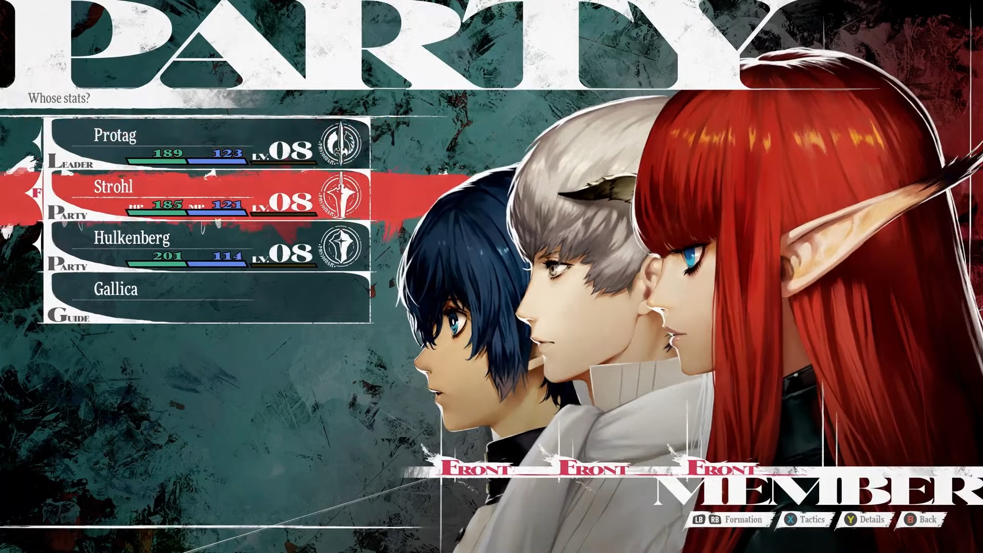
I don’t know what they’re putting in the water at Atlus HQ – a blatant lie, it’s called cultivating and retaining talent – but this crew has been putting out industry-leading UI for years. Metaphor: ReFantazio is its latest and potentially finest masterwork. Much was said of Persona 5’s flashy, grabby menus, but I’d still argue that not enough was said. In turn-based games explicitly built around navigating menus, it’s hard to overstate how big an impact that incredible menus – not good menus, not serviceable menus, not perfectly readable menus – can have. The UI frames and supports the world, and with a little personality – or two truckloads – it can elevate even the smallest interactions. Metaphor: ReFantazio has, by my rough count, at least three truckloads of personality, and its UI absolutely sings.

Every last element zips and hums and pops. Turn counters are iridescent crystals dancing in the corner. Dialogue bubbles shift and warp ever so slightly – one of many brilliant examples of movement being woven into often-static details. When your or the enemy’s turn ends, a red-blue shift signals the jump with the heavy clunk of a clock tower. The main menu – my god, the main menu – is a reactive delight, a loud but elegant and still easily navigable pillar that gives common selections like your party layout and equipment palpable weight and impact.
Cycling normal, special, and group attacks pulls you through sharp layers of icons and descriptions that still present critical information perfectly. When you use normal attacks to stun enemies in the open world, they’re tossed into the air in slow motion like volleyballs to be spiked with a spine-tingling whack, flowing right into the glassy crash of the battle transition.
This level of UI design belongs on the same shelf as the best gunplay to ever grace an FPS. It’s a comparable symphony of sound, feedback, and so many tiny details that add up to a giant difference in game feel. Metaphor: ReFantazio once again demonstrates that UI doesn’t have to be subtle or minimalist, which is an impressive craft in its own right, to be effective. It can take center stage. It can shake you by the shoulders and look you straight in the eyes. Metaphor never hides its UI; it flaunts and decorates and celebrates and loves it, and you can feel that love every minute. It brings a rare sense of energy to a genre defined by moments frozen in time, and it looks absolutely fantastic.
Metaphor: ReFantazio dazzles with seamless switching between exploration and JRPG combat.


+ There are no comments
Add yours