For all the Apple Intelligence hype coming out of WWDC 2024, there was also the undeniable downer that only an iPhone sporting an A17 Pro chip or above would support it. It’s a true case of haves and have-nots. Still, regarding sheer utility, there is one promised iOS 18 change that will come to every iPhone supporting the platform update: a Control Center makeover.
Control Center isn’t sexy or even tied to any particular, deeply embedded AI or Machine Learning iPhone capability. It’s a tool for controlling, among other things, critical utilities and doing so with a simple sweep down on the upper right corner of your iPhone screen.
It’s a panel so dull that it’s mostly devoid of color. Even the name “Control Panel” sounds like home infrastructure, not a nifty mobile feature. Of course, anyone who uses Control Center (essentially everyone with an iPhone), knows its importance. It’s fast access to connectivity, media playback, brightness, audio, Focus modes, silence features, camera, Shazam, and, maybe most importantly, Flashlight.
For quite a few versions of iOS, it’s had some customization and depth. Long presses on most of the controls bring up more detailed settings. You can also add to Control Center – if you know where to look.
The Control Center of iOS 18 will be redesigned and substantially more customizable. It will also feel a lot more like a destination.
A true utility home

Apple gave us a taste during the almost two-hour WWDC 2024 keynote, and even then, I could see just how much change was coming to the crucial iOS feature. Later, I got a closer look and saw iOS 18’s version of Control Center in action.
There are subtle design changes across all of the Control Center and the icons within it, but they look small enough to go almost unnoticed.
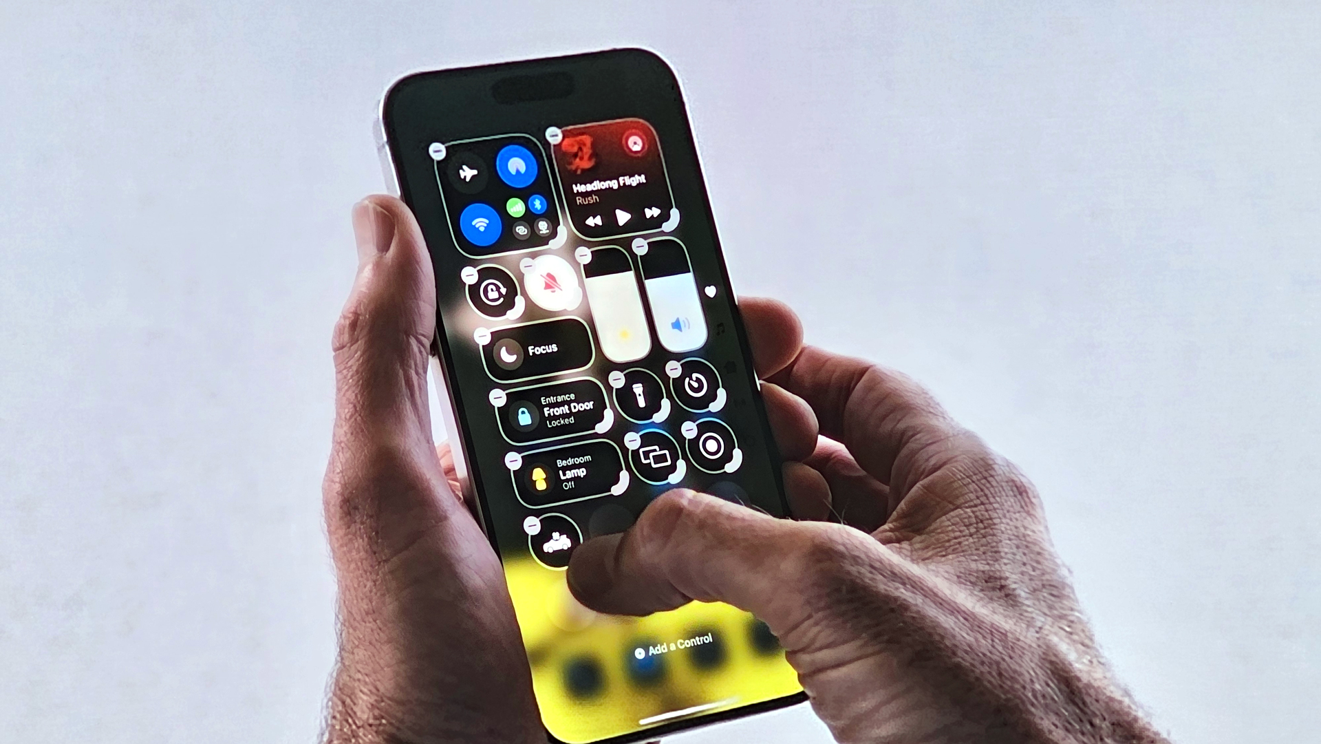
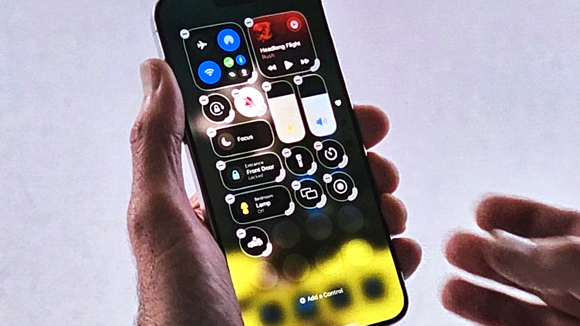
Perhaps the biggest change is that you can move Control Center icons around inside Control Center’s pages. In the demo I saw, they held down on the open Control Center panel, and after a moment, marquees appeared around each element, with minus signs so you can remove them and an extra semi-circle on the lower right corner that you can use to resize search control. I think they can be resized all the way to full Control Center pages of their own.
It’s also easy to grab and move controls around on a page or even to another Control Center page. Unlike the new iOS 18 homepage, there will still be a grid, and icons will shuffle around to fill empty spaces.
New gestures and Control Center friends

To access those pages, you can slowly flick through them or use a new continuous swipe to flip through all of them. I’m not certain how useful that’ll be, but it looks fun.
I especially like that Apple is finally making finding and adding new controls simple. When I want to add Screen Recording in iOS 17, I open my iPhone’s Settings, dig down to Control Center, and then select Screen Recording (or some other control to add).
In iOS 18, you’ll be able to add new controls inside the Control Center, and you can find them the same way you move them about by holding down on the Control Center Screen until a little “Add a Control” message appears at the bottom of the screen. That gets you into an extensive Controls Gallery but also adds a Search box, which’ll be an even easier way to find controls.
iOS 18 Control Center will also finally offer the ability to add third-party controls. Naturally, app developers have to build these, but imagine the possibilities. Your favorite app features just a swipe away, sitting alongside the flashlight.
Apple is also extending some of these options outside the Control Center. I saw how you can switch and remove utility icons, like camera and flashlight, from the lock screen (maybe you want the QR Code reader instead). You could even remove all of them for a totally clean look.
Of all this, and there’s a lot of change for the Control Center, the biggest news might be that this is coming to all iOS 18-supporting phones. There is no need for Apple Intelligence or a special and more powerful phone. That means all iPhones going back to the iPhone 12 get the Control Center makeover.
It’s a little balm to soothe the pain of possibly not getting in on that sweet Apple Intelligence action, right?


+ There are no comments
Add yours