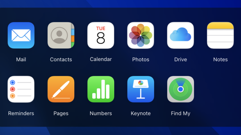
In a rare event, Apple has rolled out substantial updates to the web-based iCloud interface meant to allow users to access Apple services like Mail and Photos when they’re away from a Mac, iPad, or iPhone.
The flagship addition is dark mode; it “will automatically match your device settings with a Light Mode or Dark Mode color scheme,” Apple explains as part of the update.
There is also now a way to customize the background for the iCloud web interface—specifically, you can choose between several colors.
A few apps received features that have been available on iOS and macOS for a while. For example, the Notes web app now supports pinned notes, and iCloud Drive supports shared views.
If you think all that seems like it’s pretty basic and late to the game, you’re not wrong.
The iCloud web interface has long seemed like an afterthought for Apple, and it has always been far behind Apple’s native software platforms in terms of features. How far behind? Well, consider this: dark mode was previously added to iOS way back in iOS 13.
Apple’s narrative to investors has long said that its services like iCloud are key to making up for slowed hardware sales in the mature smartphone market. To that end, the company has made this web interface available and has brought some of its services like Music and TV+ to other platforms like Windows and Android.
However, there seem to be limits to that. As noted, iCloud for web has historically been a subpar experience, and other key services like Messages have not been made available on other platforms at all, possibly to avoid losing the social lock-in advantage of Messages for iOS. (Messages is notably absent in the web app.)
Still, it’s nice to see any movement at all here. While iCloud.com gets infrequent and small updates, it remains actively supported at a basic level.


+ There are no comments
Add yours