Andrew Cunningham
This past weekend, I said goodbye to Apple’s 4.7-inch iPhone 6 design, after 10 long years.
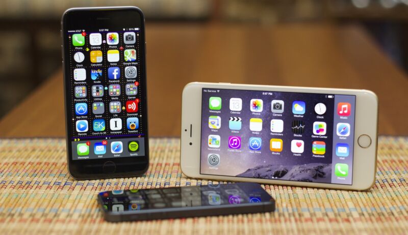
It started with the iPhone 6 itself in 2014, a long-awaited screen size upgrade for the iPhone (some of the 2011-era Apple punditry insisting that 3.5 inches was the functionally perfect size for a phone screen and that Apple would never, ever change it, is an interesting time capsule). It ends with my wife’s third-generation iPhone SE, its battery capacity already collapsing, which I replaced with an iPhone 16 on Friday.
There are huge differences between those two phones—eight years’ worth of spec upgrades and water resistance being the most significant—but they look and feel almost the same, and things that were fine or forgivable in 2014 have become harder to live with now.
What follows is less a celebration of the iPhone 6 design’s long life, and more of a good riddance. It’s not that we never had any good times together, iPhone 6 design, but after a half-dozen versions of you I think it is time for both of us to move on. Consider it catharsis—and maybe if someone in your life is still rocking an iPhone 8 or iPhone SE, it will be cathartic for you, too.
Battery capacity
Battery life was always an Achilles heel of this phone’s design—the battery had to fight with every other component in the phone for relatively little space, and as a result it was always exceptionally hard to make it through a full day on a single charge. A portable battery pack or some kind of midday charge was almost always necessary, especially if I had deigned to use a power-hungry feature like Personal Hotspot.
And more charging means putting more cycles on the battery, which over a couple years of ownership just makes the mediocre battery life even worse. The battery life in my first “modern”-style iPhone—an iPhone XR, in 2018—was a revelation after years with the 6, 6S, and 8, and since then I’ve found my iPhone 13 Pro and 15 Pro to be similarly capable of making it to the end of the day with some battery to spare.
Those curves—specifically, those curved edges

Andrew Cunningham
I put all of our phones in screen protectors and cases, despite usually also springing for AppleCare+. Especially when you’ve got a kid, it’s worth it not to have to worry about every little drop or bump, and they’re good for the resale value, too.
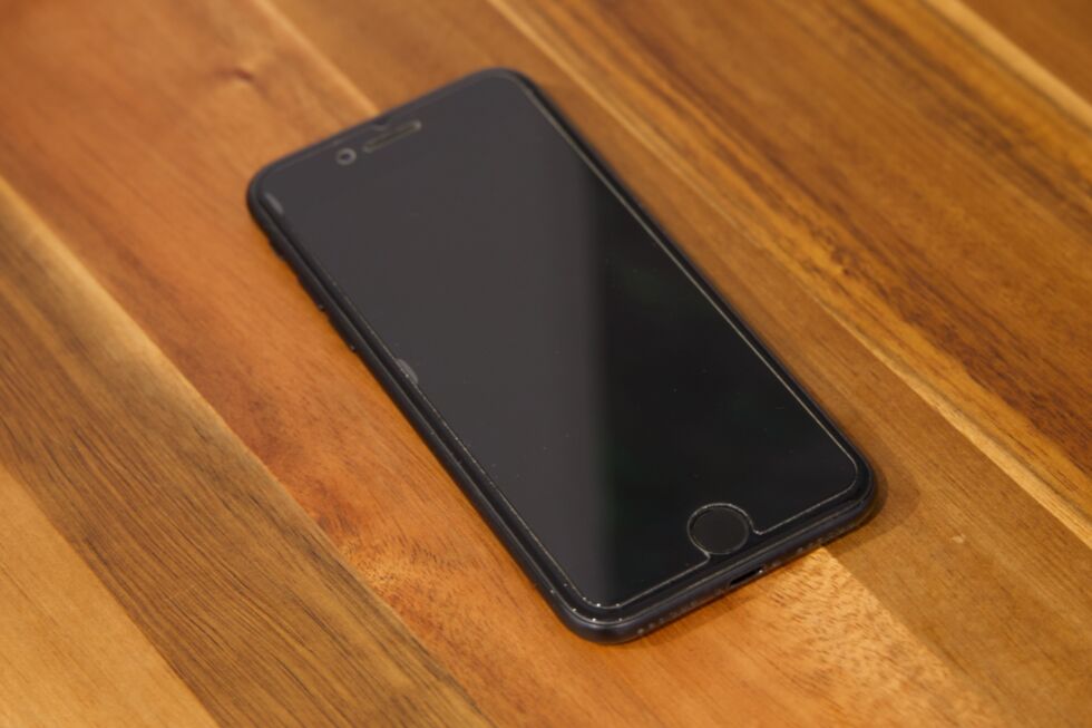
One thing about the iPhone 6-era design was its curved edges, including a subtle curve all the way around the edge of the screen. Over many years with this phone’s design, I have slowly come to hate this subtle curve—screen protectors either fail to make contact with the screen all the way around its perimeter, leaving annoying visible air bubbles, or they do make contact on the flat part of the screen while leaving the curved edges of the glass unprotected. The small ridge created by the screen protector ends up being a trap for dust and other little bits of detritus.
Apple returned to an all-flat-edges design with the iPhone 12 in 2020, reverting to what had been the norm with the iPhone 4 and 5 design. On a flat slab of glass, the additional layer of a thin glass screen protector is nearly invisible when you apply it right, being careful not to trap any dust between a freshly cleaned screen and the protector (my wife goes through roughly one screen protector every three or four months; I have become adept at this dance). It’s nice to be able to guard against scratches and cracks without having to look at and think about it all the time.
And if you’re not the case-and-screen-protector type? One of those “I have AppleCare so I don’t need a case” people? The curved edges of the iPhone 6-era design made the phones more slippery and harder to hold. I thought that was even more true for the iPhone 8/SE version of the design, which switched from an aluminum back to a glass back to enable wireless charging support.


+ There are no comments
Add yours